UX Architect Consultant
Outdated desktop billing delayed physician billing, causing lost revenue and extra admin work.
Created a mobile-first app for real-time billing at point of care, with alerts, smooth workflows, and auto-save.
Increased billing completion, reduced revenue loss, and boosted physician adoption by simplifying billing tasks.
During initial conversations with stakeholders and physicians, one urgent challenge became clear: Mednax physicians lacked an efficient way to bill patients at the point of care. The existing billing process was desktop-bound, tedious, and often delayed until the end of the day—sometimes even days later. This not only led to missed billing opportunities and a loss in revenue but also increased administrative burden, negatively affecting physician focus and patient care quality.
Physicians needed a solution that allowed them to quickly and accurately complete billing tasks between or during patient interactions—without friction, without lag, and without having to wait until they were back at their desks..

The product vision was to create a mobile-first billing application that empowers physicians to complete billing tasks quickly and accurately at the point of care. The app needed to be simple, intuitive, and context-aware, reducing administrative burdens while seamlessly integrating into physicians’ daily workflows. From a business perspective, the goal was to address the revenue loss caused by delayed and incomplete billing in the existing desktop system.
By enabling real-time billing with personalized alerts and efficient workflows, the solution aimed to increase billing accuracy, improve physician adoption, and ultimately boost Mednax’s revenue cycle while maintaining scalability across specialties.

My UX strategy was rooted in aligning Mednax’s business goals with the real-world needs of its physician-users. I adopted a user-centered approach focused on reducing billing friction and increasing revenue recovery. Physicians—some located across different states—were not only stakeholders but also the end users of the billing flow. Their time was limited, yet their input was critical. I made sure to involve them early, even remotely, and created a process to gather insights despite logistical constraints. I also worked closely with the engineering team to ensure that their feedback translated into technically feasible solutions within Mednax’s IT infrastructure. My strategy prioritized simplicity, speed, and low cognitive load—ensuring billing tasks could be completed accurately and in real-time, without disrupting patient care. This alignment between user experience and business value helped me design a solution that was both effective and scalable across specialties and workflows..

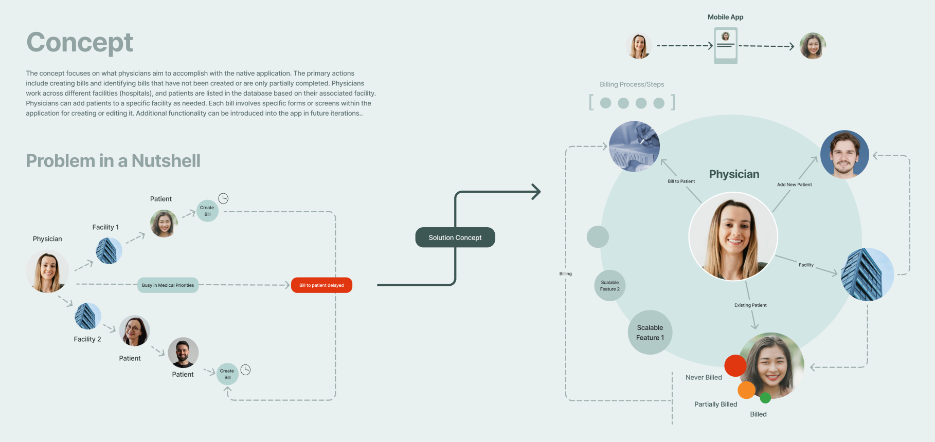
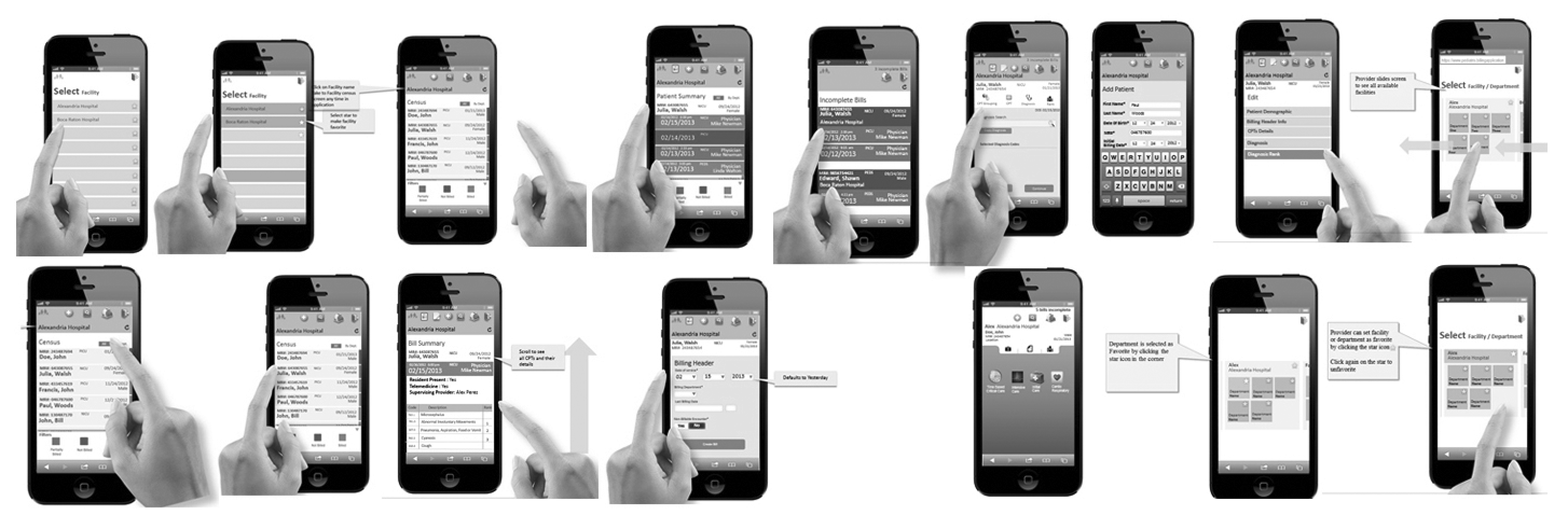
During the discovery phase, we immersed ourselves in understanding the real-world environment of Mednax physicians. We learned that physicians often work across multiple Mednax facilities, each maintaining its own patient roster. This multi-facility context created complexity for physicians who needed to access accurate billing information seamlessly as they moved between locations. Physicians were fast-paced and highly focused on patient care, making it critical to reduce any friction in their billing workflow. Observations and conversations with physicians and administrative staff revealed that manually switching between facilities to access patient lists was cumbersome and prone to errors. These insights set the stage for designing a solution that could adapt dynamically to the physicians’ environment.

The research phase focused on understanding the existing billing workflow and identifying pain points from the physicians’ perspective. Through interviews and contextual inquiries, I discovered that physicians worked across multiple Mednax facilities, with each facility maintaining its own separate patient list. At the end of their shifts, physicians manually selected the facility they were working in, accessed the corresponding patient list, and then created bills for the patients seen that day. This manual process of switching between facilities was time-consuming and disrupted their workflow.
Physicians emphasized that the billing system lacked clear tracking for pending bills, dues, and due dates, which often led to delayed billing and missed revenue opportunities. Additionally, there was no unified way to monitor patient bills linked to medical exams or tests, increasing cognitive load and administrative overhead. An administrative staff member demonstrated the desktop application currently in use, which confirmed many of these inefficiencies. This walkthrough highlighted how the existing system required physicians to postpone billing tasks to downtime, increasing the risk of errors and revenue leakage.
Design Workshop
Involving stakeholders early on proved extremely advantageous, helping us break down complex concepts faster than anticipated. Through a series of meetings, we thoroughly understood their vision and contributed ideas to define the app’s scope. Quick sketches and visuals played a vital role during these discussions, as they helped align diverse perspectives more effectively than verbal explanations alone. Given that some physicians and stakeholders participated remotely via video calls, we adapted our collaboration approach to focus on verbal feedback and visual presentations instead of formal exercises like card sorting.
My goal was to foster a collaborative environment tailored to stakeholder comfort levels to extract the best input possible. Once all ideas were on the table, we separated realistic application goals from desirable features, clarifying which user tasks would be prioritized. Throughout these sessions, the in-house mobile development team provided critical feedback, sharing IT infrastructure limitations and technical feasibility. Their insights shaped core functionalities such as patient search, adding new patients, creating bills, and completing incomplete billing tasks. Key features like visual billing status indicators, favorite diagnosis codes, and prompts for unbilled or incomplete bills were also identified as essential to improving the user experience.
Personas were then developed based on these insights to represent diverse physician workflows across facilities, guiding the design toward an efficient, scalable solution.

After gathering insights from interviews, observations, and early stakeholder collaboration, I moved into defining the problem space clearly. I created personas to better understand the motivations, needs, and frustrations of Mednax physicians. I was especially curious about their favorite websites and apps, the types of devices they used beyond computers, and which design elements they found intuitive and enjoyable in other digital tools. These insights helped shape a solution that felt familiar and accessible.
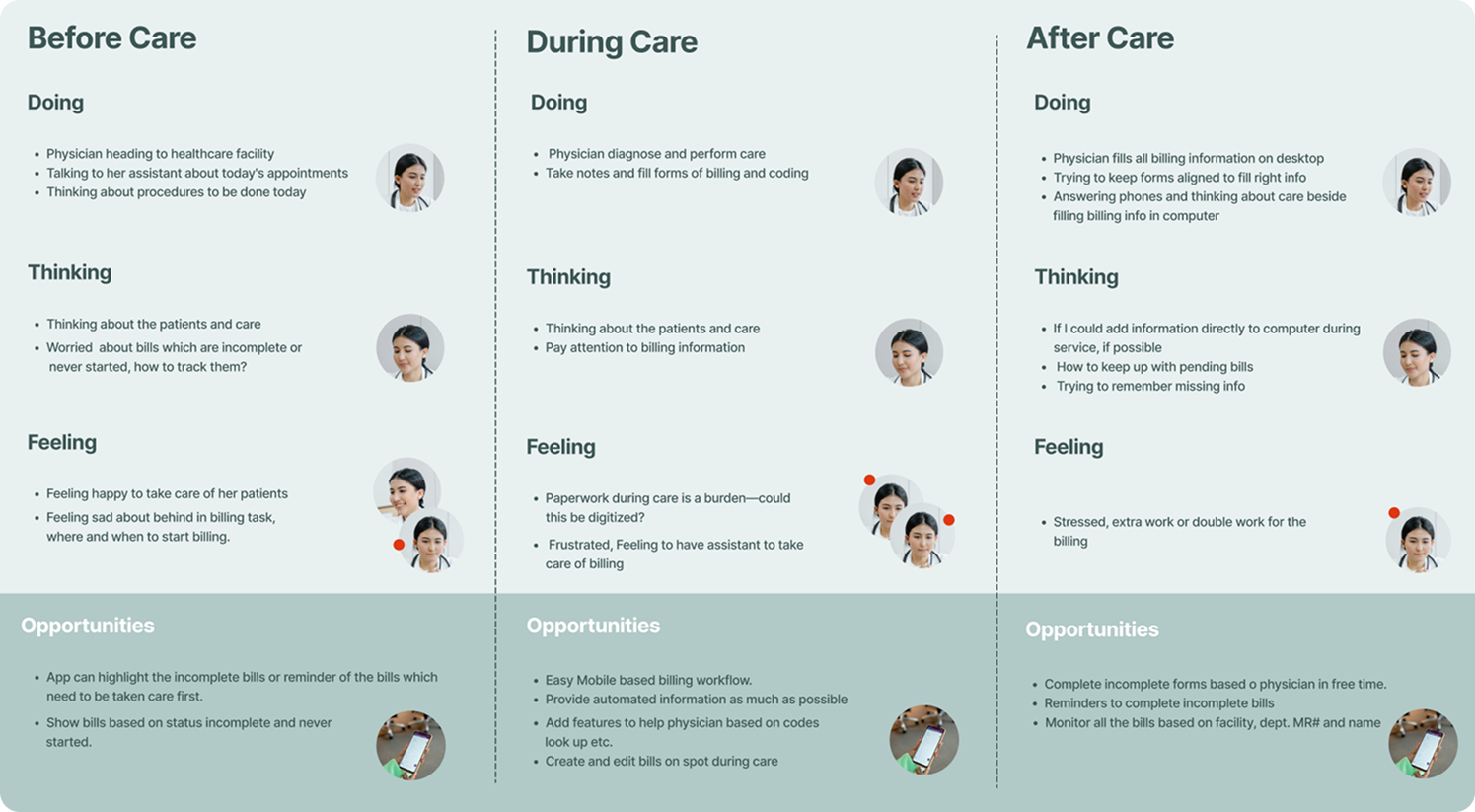
To visualize the billing workflow from the physicians’ perspective, I developed user journey maps informed by our research. These visualizations helped identify friction points and areas of opportunity. One critical insight emerged during both the journey mapping and interview sessions: physicians had no reliable way of being reminded about incomplete bills that still needed to be submitted. This gap not only caused delays in the billing process but also directly affected revenue flow.
Through this phase, I began shaping key features that would address these gaps, such as visual indicators for billing status and smart reminders, laying the foundation for a more intelligent and frictionless billing experience..
To solve the core problem—helping physicians stay on top of their billing tasks without interrupting patient care—I began by mapping out the user journey. I focused on the before, during, and after phases of their workflow to identify needs, friction points, and opportunities. The "before" phase emerged as critical, where physicians needed timely alerts about new patients, bills to create, or incomplete records. However, both "during" and "after" phases also held strong potential to boost productivity—especially with features like autosave during patient visits and quick access to pending tasks afterward.
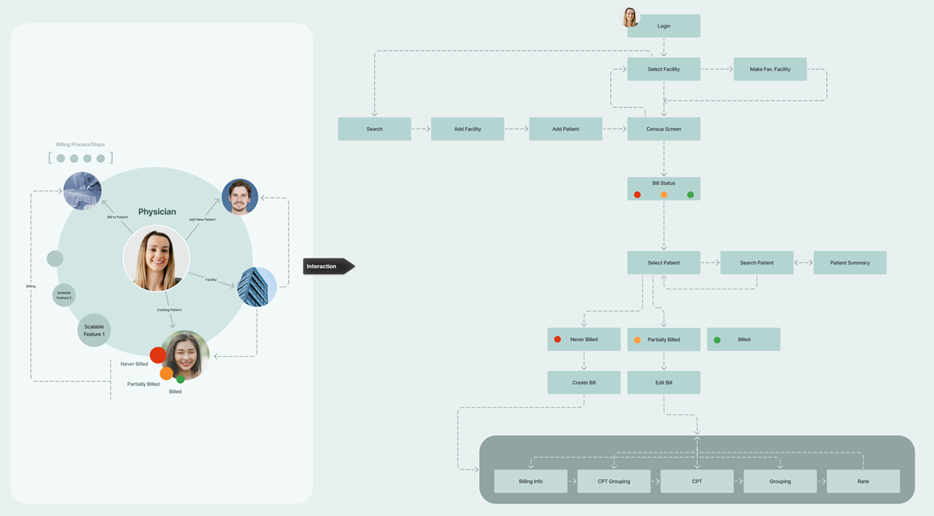
I created a comprehensive information architecture aligned with the user journey map. It clearly outlined what physicians needed at each step and what features could best support them. This structure helped me visualize and prioritize solutions addressing gaps like reminders for unfinished bills, efficient patient lookups, and seamless resumption of saved drafts.
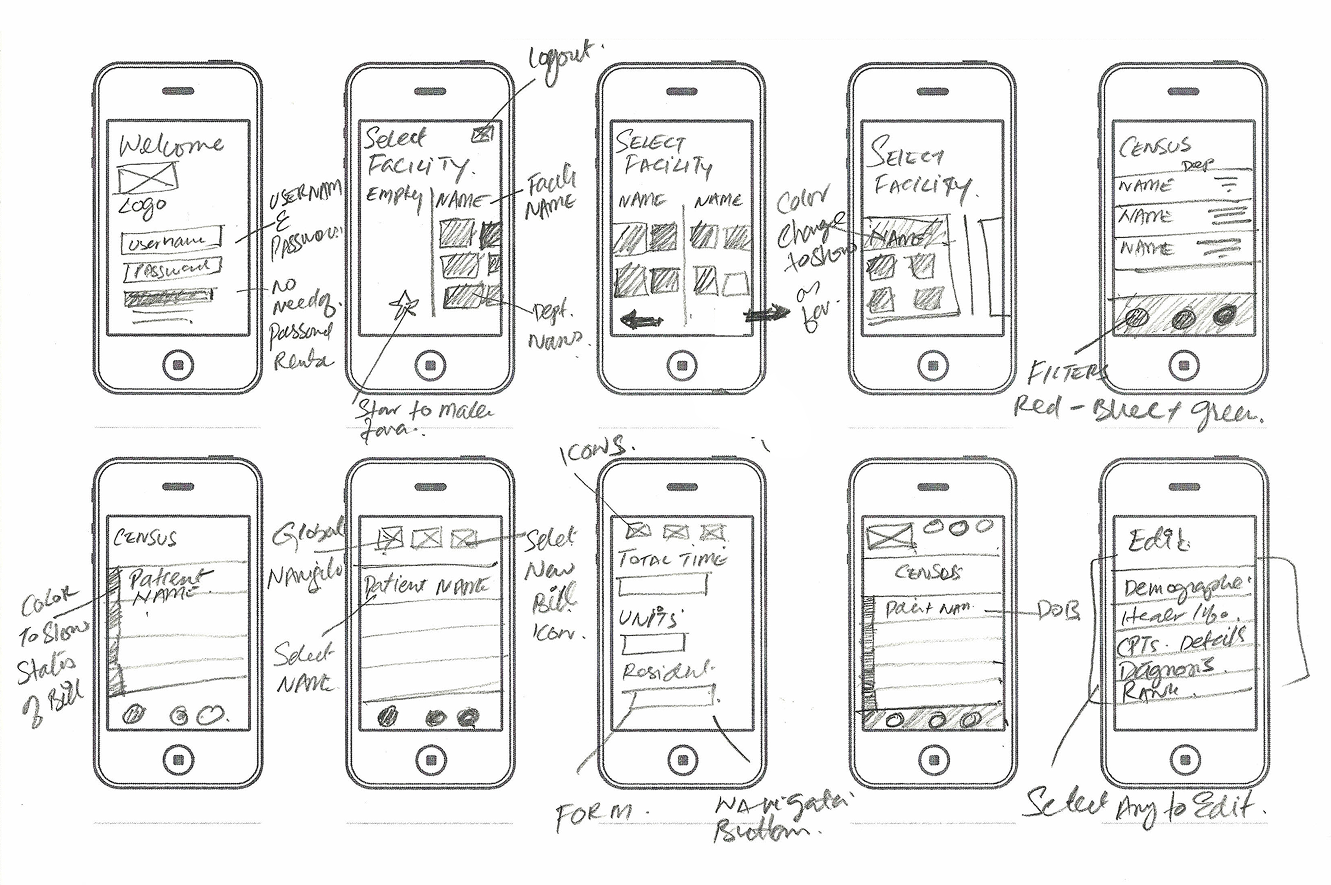
With the IA in place, I began sketching in my notebook to explore layout ideas and interaction patterns. These quick sketches helped me think through different workflows and rapidly gather feedback from peers and stakeholders. I then translated these into low-fidelity wireframes, focusing on clarity of interaction and flow rather than UI polish. The goal was to test concepts and see how well the information architecture supported user goals.
My goal was to make the experience not only functional but adaptive to physicians’ individual needs. I examined available user data to identify ways to reduce effort, increase trust, and improve efficiency. This sparked questions like:
These insights influenced how I shaped features and user flows, ensuring the app felt tailored and respectful of physicians’ time.
Based on the refined wireframes and personalization strategies, I mapped out key user flows to reflect real-world scenarios. These flows accounted for different entry points and user objectives, such as creating a new bill, continuing an incomplete one, or reviewing alerts. I consolidated these into a single flow that could adapt based on user context. After team review and consensus, I documented the flows as a foundation for interaction design and development planning.

After validating the wireframes and user flows through iteration and feedback, I transitioned into high-fidelity design to bring the experience to life with polish and precision.
I created high-fidelity wireframes based on the refined low-fidelity sketches and flows. My focus was to translate the functionality into clear, intuitive interactions that supported the physicians’ goals with minimal friction. These designs reflected the intended personalization strategies—like pre-filled forms, user-specific greetings, and language preferences—and demonstrated how they would function in real-world use. The goal at this stage wasn’t just aesthetics, but clarity of action: making sure every element supported a task, reduced friction, or communicated something important. I designed with a mobile-first mindset, considering the environments in which physicians would interact with the app—often on the go or between patient visits.
I conducted one-on-one usability testing sessions with key persona types. While I mostly observed, I occasionally asked probing questions to uncover mental models and friction points. These sessions surfaced valuable insights, including confusion around certain iconography, a need for more intuitive data visualization, and adjustments in navigation flow. I iterated accordingly, refining structure, layout, and micro interactions.
For heavier data-driven features, I kept performance and usability in mind—particularly since the app would be used on mobile networks where bandwidth might be limited. I designed a few key screens with full visual detailing to set the tone and handed over style guidance and direction to junior designers, who continued production under my oversight. I reviewed and approved all screens to ensure consistency in layout, typography, interaction, and overall tone.


From the beginning, I collaborated closely with the application architect and lead developers. My goal was to ensure feasibility while pushing for the best possible user experience. My prototypes, flows, and annotated designs helped developers understand interaction intent clearly. I remained accessible throughout the build, answering questions, clarifying behavior, and reviewing implementation to ensure the product met both functional and experiential expectations.

I learned tremendously from this project, especially the importance of designing within multiple constraints. Uncovering the complexity of Mednax’s existing systems and identifying technical, operational, and user-centered limitations was a daunting yet crucial part of the process. Navigating these constraints shaped the solution into one that was both practical and effective.
Another key lesson was the value of team collaboration. Bringing together diverse perspectives—from physicians scattered across states to engineers and business stakeholders—helped uncover unique insights and fostered creative problem-solving. While managing differing viewpoints could be challenging, it ultimately led to a stronger, more user-centered product. Respecting each team member’s time and input was essential in maintaining momentum and securing buy-in.
The impact of the project was significant. By delivering a mobile billing application that simplified workflows and provided timely reminders, we improved physicians’ ability to manage billing tasks without detracting from patient care. This increased billing accuracy and timeliness directly contributed to reducing revenue leakage for Mednax. The personalized, scalable solution also set the foundation for future enhancements across specialties and locations.
Overall, the project reinforced how thoughtful UX design, grounded in real user needs and strong collaboration, can drive meaningful business results and improve everyday work for healthcare professionals.

Certified in UX Design & Agile Methodology
© 2025 Saqib Mughal — All rights reserved