Sr. Product Designer
Legacy system blocked short stays, frustrating users and limiting revenue.
Redesigned booking to support short stays with flexible, user-friendly flows by date or destination.
Unlocked new revenue streams and improved user satisfaction through a modern, adaptable booking experience.
Interval International, a Marriott Vacations Worldwide brand, offered getaways/vacations for only a week (7 days) on its website. It is a timeshare company where members book resorts for a maximum of a week. The business soon realized that members sometimes checked out before completing seven days as they preferred short getaways according to their vacation plans. As a result, the resort remained vacant for the rest of the days. The business considered this a revenue-generating opportunity by introducing getaways for less than seven days as well to avoid vacant days. It was a win-win situation for both the business and the members because the company offered lower prices for short getaways (less than 7 days). From the company’s perspective, it was an opportunity to increase revenue by accommodating the vacant days.

The business aimed to capture the revenue lost from vacant days by enabling short-stay bookings while maintaining member satisfaction. The vision was to create a convenient, affordable, and flexible booking experience that supports both full-week and short-getaway options, unlocking new revenue streams for the company.

As the UX designer, I had a clear vision to investigate and present ideas that could help stakeholders visualize the long-term benefits of combining two separate applications into a single, unified experience. I believed this approach would not only simplify the user journey but also open up opportunities to increase revenue. My strategy was not to build new features on top of a system already struggling with poor user experience. Instead, I advocated for creating a modern UX foundation first, knowing it would better support new features over time. Otherwise, we’d simply be multiplying UX problems for the sake of speed—rushing to market with a flawed experience would only lead to costly redesigns and redevelopment later.
I saw it as my responsibility to demonstrate what was possible—even if immediate implementation wasn’t feasible. I developed quick, rough concepts to showcase potential improvements and encouraged the team to think beyond short-term fixes. If we already knew the problems, it made more sense to solve them now rather than layering new complexity onto an outdated system..

We began by meeting with stakeholders to understand the primary user goals and identify the key features expected in the application.
Stakeholder Workshop & Card Sorting. In our first in-depth session, I facilitated a collaborative card sorting workshop with business stakeholders. Everyone was given sticky notes and markers to write down ideas, which were then posted on a whiteboard. We grouped duplicates and organized inputs into two main categories: user flows and feature ideas.
Often, the ideas were a mix of both, so this activity helped us separate and prioritize the core user flows from supporting features. The goal was to define the user journey from a business perspective, allowing the team to begin visualizing how the product would take shape. The IT lead also participated, providing crucial feedback on feasibility, technical constraints, and cost implications based on the existing infrastructure.
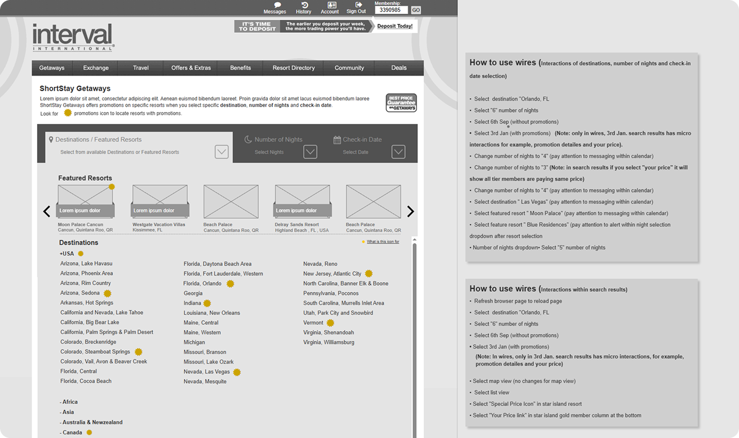
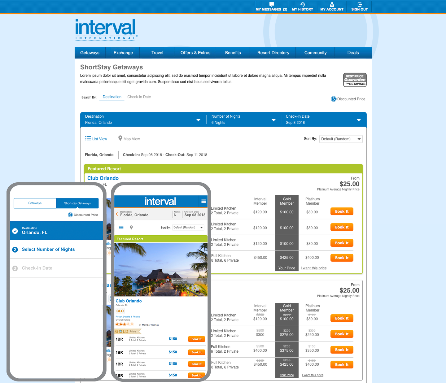
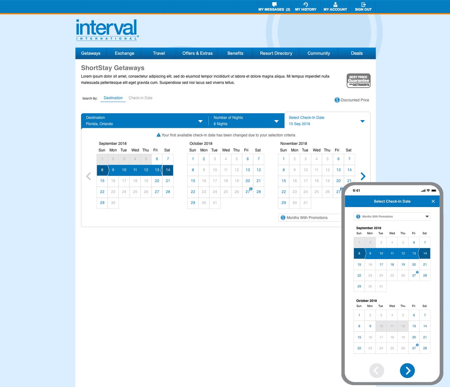
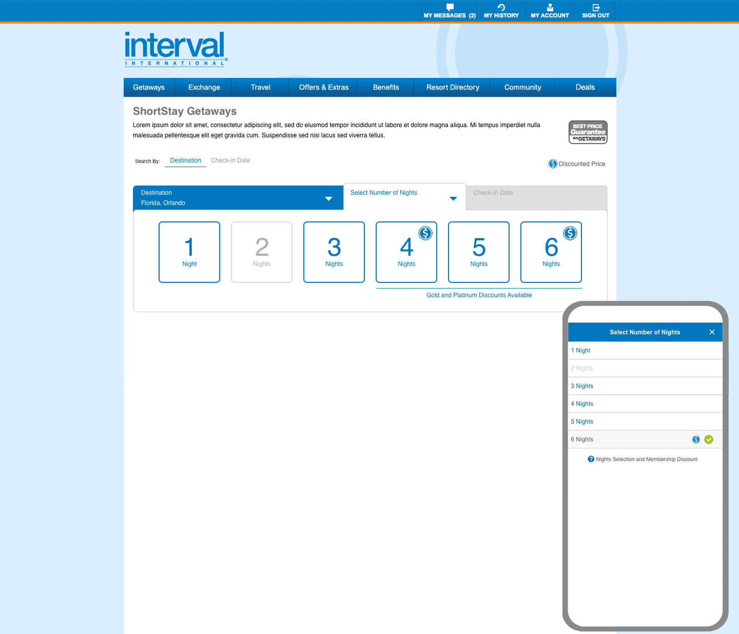
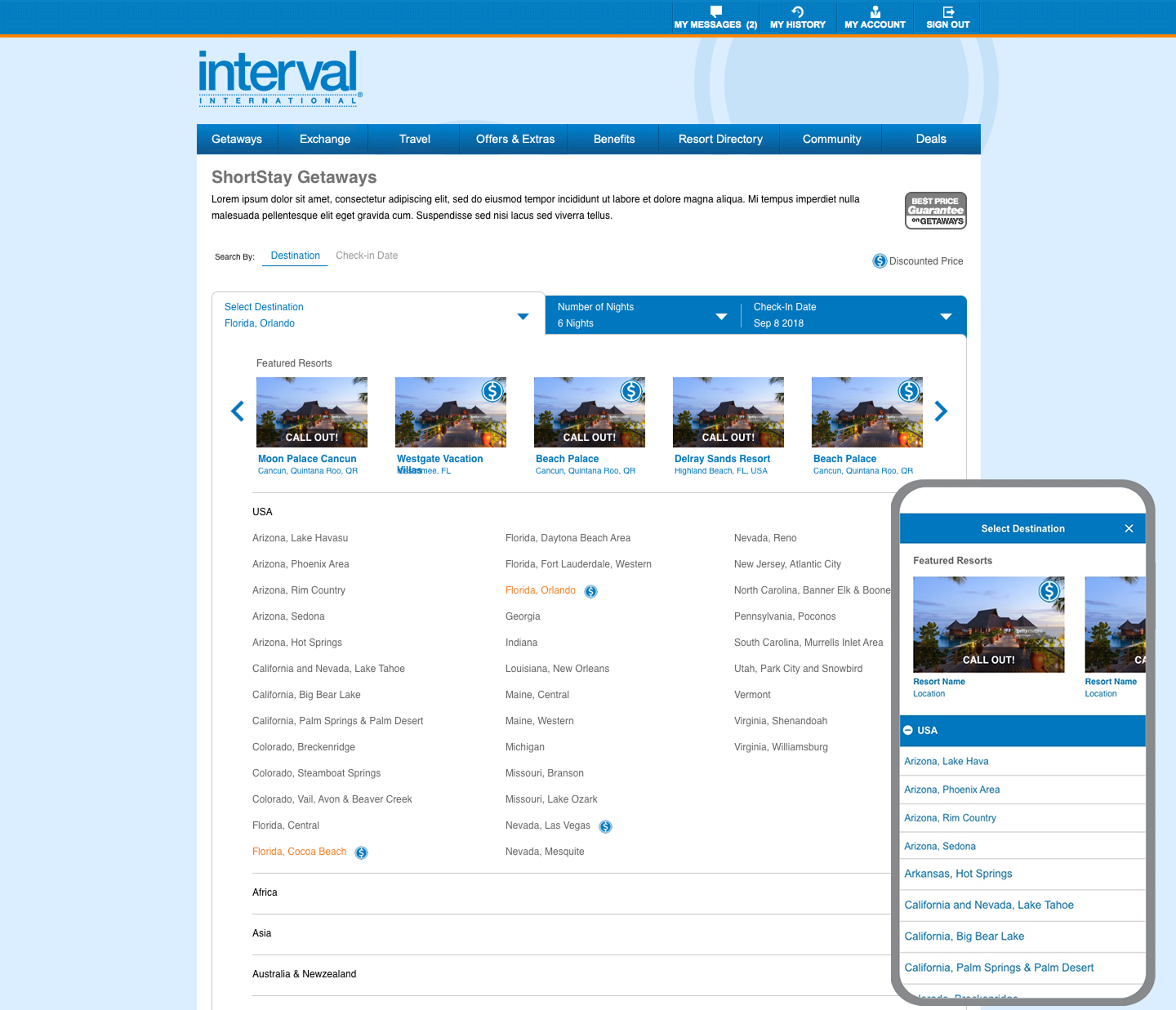
By the end of the session, we had a clear core user goal for the application: “Enable users to select a single destination from available options, choose the number of nights for their stay, and pick a check-in date.”
Uncovering a Key Feature: Special Pricing for Resorts
During this exercise, a major feature emerged—resorts offering special pricing during periods of low occupancy. The Inventory team highlighted this as a strategic opportunity to boost bookings. However, no business rules yet existed for how or when these discounts would be applied.
To define this feature, I led several follow-up meetings with the Inventory and Business teams. We explored current inventory data, discussed backend system capabilities, and outlined how special pricing logic could be integrated. While these discussions were highly technical, they helped me understand the underlying mechanics, which in turn shaped what should be visible to users in the frontend experience.
Eventually, we aligned on clear business rules:
“Some resorts will offer special prices only for specific destinations, limited check-in dates, and a minimum number of nights.”
This decision required backend rule integration and coordination with the inventory management system. The result was a well-defined offering that balanced user needs with business strategy and system feasibility..

Besides, I had to do some user research of those who were using the existing application to collect insight from the user’s perspective. As my focus was more on short getaways consisting of less than a week so I listened to the flaws of the existing application keeping the new application in mind. So, the best way to start my research was by visiting our calling center as the call center agents used to book vacations for the users who took the help of interval agents for booking instead of using the website themselves
I interviewed few call center agents to know the preference of the user while booking their vacations, what works and works not, and other similar questions. I literally wrote down my questions a day before just to avoid skipping anything important. Unexpectedly, I got to know an interesting fact that our members did not have a clear preference. Either they are flexible on check-in dates when units are available in the desired destinations or whether they are more flexible on the destination and want a specific check-in date.
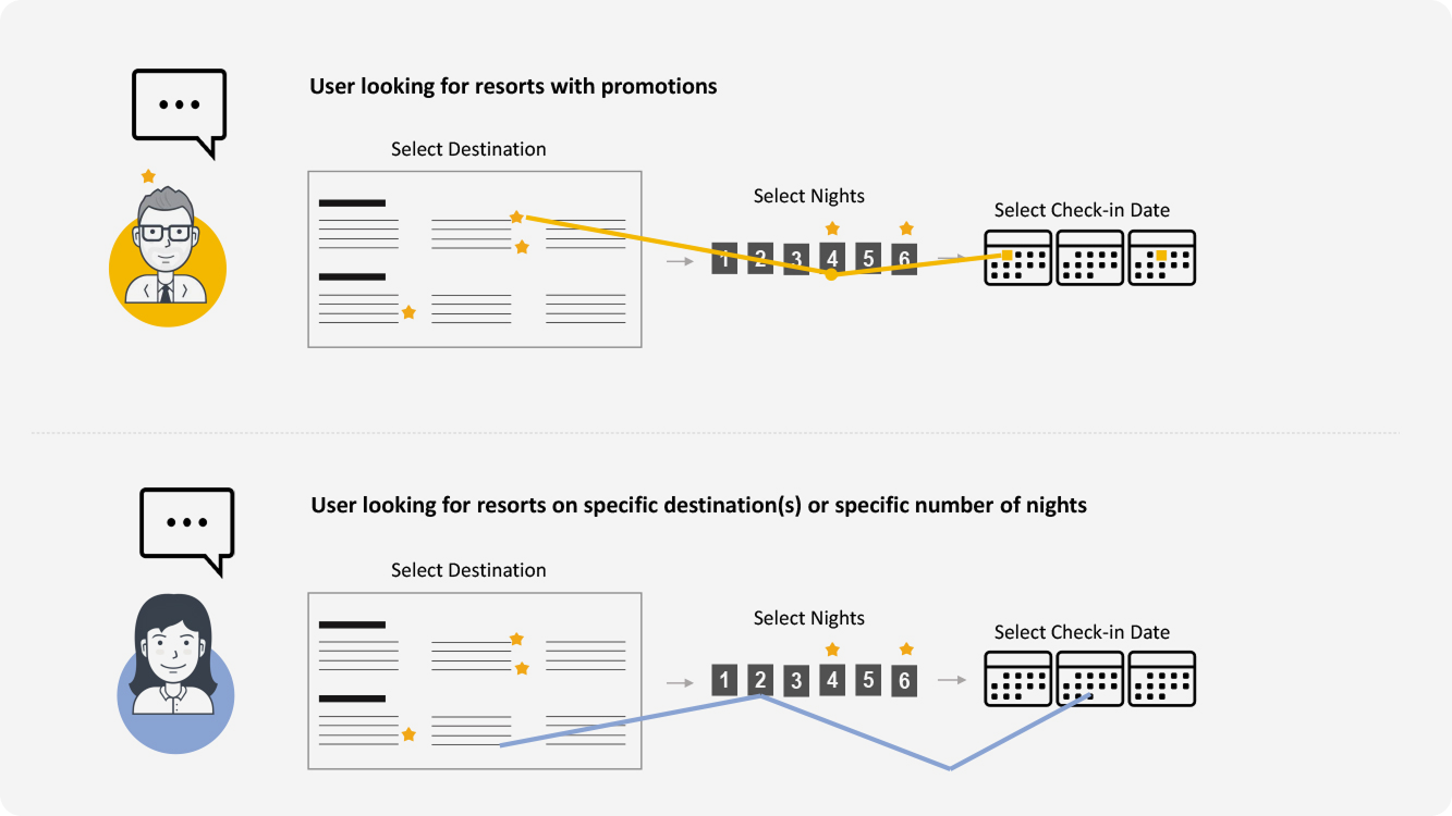
After discussing with the call center agents and supervisors it became clear that the members were sometimes flexible on check-in dates and sometimes on destinations based on their vacation plans. It means both are important and it's up to the user at the booking time what they are specific about whether destination or check-in date. On the website, we did not have any option in which the user can search by destination or by check-in date. I took notes that helped in my ideation process to bring an option that could allow members to book vacations by searching "destination" or by "check-in date". Subsequently, I interviewed a focus group from the perspective of the new application. I asked questions about their likes and dislikes as this particular information could help me to create personas. I frequently questioned about special price resorts and their reaction towards it. I generally asked if they had used any product at a special price and what they liked about it. Following the feedback, I interrogated their experience on our website and our competitors. I also tried to ask questions from which it could validate further that members would like to have flexible search by destinations and by check-in dates. It was an interactive session that leads to an emphasis on new points while discussing with users directly.
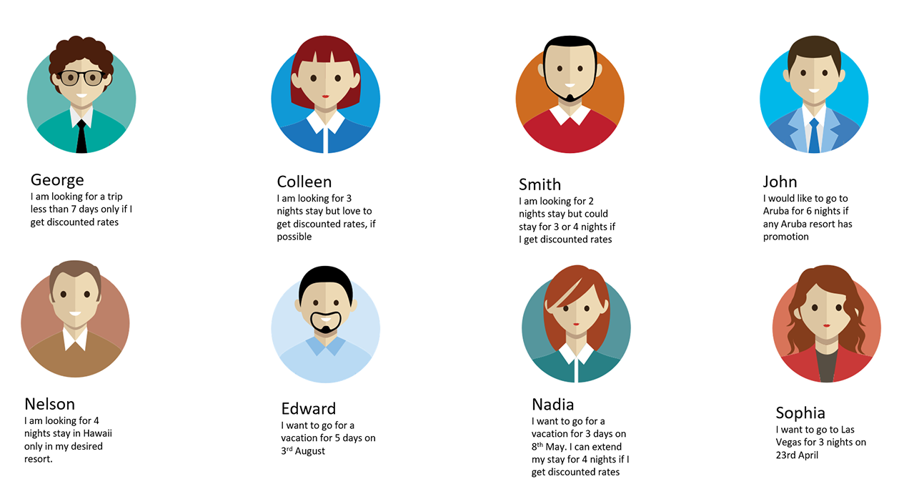

In this phase, I developed personas based on insights gathered from focus group sessions and targeted user questions. The personas helped clarify who we were designing for and ensured the team focused on user needs. One user group was primarily interested in booking only where special price resorts were available, while the other group prioritized specific destinations or check-in dates, regardless of discounts. To better understand user behavior and pain points, I created user journey maps for each persona. This allowed me to step into the user’s perspective and identify common actions and expectations across journeys. It became clear that the UI needed to guide users by highlighting which destinations had resorts with special pricing, what the minimum stay requirements were, and which check-in dates qualified for those offers. I then prepared a detailed presentation to share these findings with stakeholders. My goal was to align the broader team on user goals and key requirements. The team agreed with my analysis, as I provided clear rationale backed by user data. We established a shared understanding that the application must support two distinct booking behaviors: users flexible on destinations but fixed on dates, and users fixed on destinations but flexible on timing. From this, I defined clear UX requirements to visually communicate pricing, stay rules, and date availability—ensuring the product would serve both user types effectively.

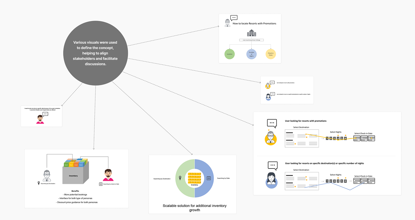
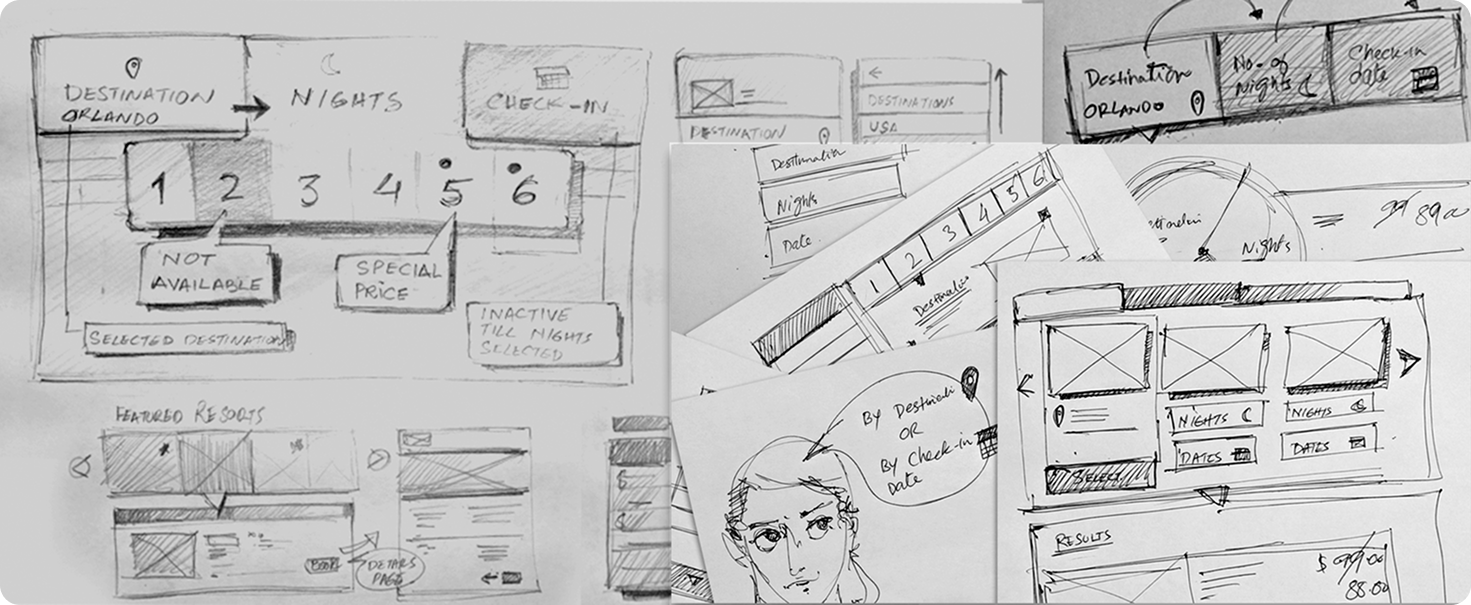
My ideation process always begins with paper, pencil, and a whiteboard—tools that allow for quick thinking and open collaboration. I involve teammates early, believing that strong ideas often come from diverse perspectives. At this stage, I focused on generating and validating user flows and scenarios that would guide our product decisions.
I mapped user flows from login to booking completion, carefully considering real-world behaviors and edge cases. Collaborating closely with the business analyst, I uncovered scenarios that impacted both design and system logic. One such example was when a user begins booking the last available resort in a destination, but another user confirms it first—causing a “no availability” issue mid-journey. This insight led to revisions in both the user experience and the information architecture, ensuring users would see helpful prompts and fallback options in such cases.
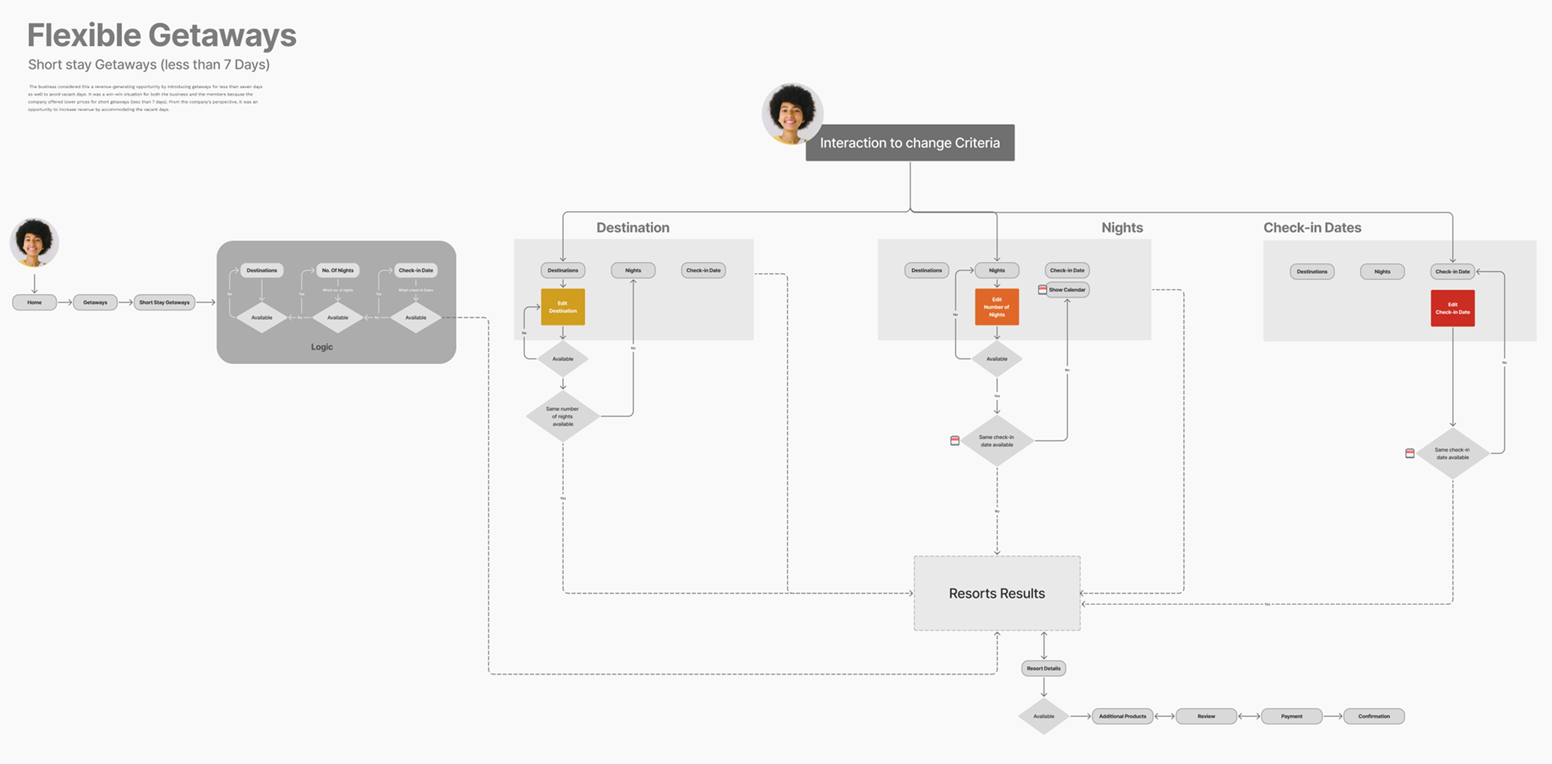
With the user flows in place, I moved into designing interactions tailored to a highly conditional search process. The product required the user to first select a destination, then choose from the available resorts, and define a stay length that would then determine available check-in dates. This logic-based flow was necessary due to how the inventory system functioned. The challenge was to simplify a complex interaction while keeping it intuitive. I created a progressive selection experience—guiding users step-by-step in the order the system checks availability—reducing cognitive load and making the flow feel natural.
I rapidly translated these ideas into low-fidelity interactive wireframes, which I tested in a controlled focus group using Morae software. Recording user sessions helped me analyze behaviors, spot friction points, and iterate with precision. The footage also served as valuable evidence when presenting concepts to stakeholders, grounding design decisions in user feedback. With each iteration, I refined the prototypes to align closely with both user expectations and business constraints—establishing a clear structure that represented the final information architecture, interaction model, and visual layout ready for the design phase..

I shared the final prototype with stakeholders through a recorded walkthrough, explaining the complete experience—including interface behavior, business logic, and technical reasoning behind the design. The video allowed team members to revisit the details and gain a full understanding of the user experience. A few suggestions came in from stakeholders, which I quickly incorporated to keep progress on track.
Once the prototype was approved, I created the final visual design myself. I refined the layout, visual hierarchy, typography, and component styles to align with the interaction model and usability goals. Every visual decision was grounded in the user experience strategy I had developed, ensuring that the final product was not only polished and modern but also intuitive and consistent across use cases.
For final validation, I placed the polished prototype—including the complete visual design—in front of a user focus group. Users were largely pleased with the experience. Despite the complexity involved in searching and booking resorts, they found the interface simple and intuitive. Their ability to navigate and understand the system confirmed that the design successfully masked underlying complexity with clarity and usability..

Throughout the project, I worked closely with the business analyst, inventory managers, developers, and front-end engineers to ensure alignment across all disciplines. While the IT team lead and project lead were involved early in the product design phase, it was critical to bring the entire development team up to speed as we moved closer to implementation.
Although my prototype walkthrough videos were shared ahead of time, I also conducted live presentations for the developers—clarifying the reasoning behind design decisions and answering their questions. I ensured they understood the product not only from a technical standpoint, but also through the lens of user needs and business goals. This helped the team establish accurate programming logic, especially in areas involving inventory rules and edge-case scenarios. By maintaining open communication and involving all key roles—including business analysts, inventory managers, and both back-end and front-end developers—I helped build a shared understanding that supported smoother execution and fewer revisions during development.

Designing this product reinforced an important lesson: even the most complex systems can be simplified when you take the time to fully understand the business rules, technical limitations, and user needs. Curiosity, asking the right questions, and pushing beyond surface requirements uncovered critical insights that shaped the user experience in meaningful ways.
Collaboration was also key—bringing together cross-functional teams ensured that every piece of the puzzle was aligned, from user goals to backend logic. As a result, we created a solution that not only pleased users with a clean, intuitive interface, but also enabled the business to make use of previously idle inventory. This improved product adoption and directly supported revenue growth by increasing booking flexibility and reducing drop-offs

Certified in UX Design & Agile Methodology
© 2025 Saqib Mughal — All rights reserved